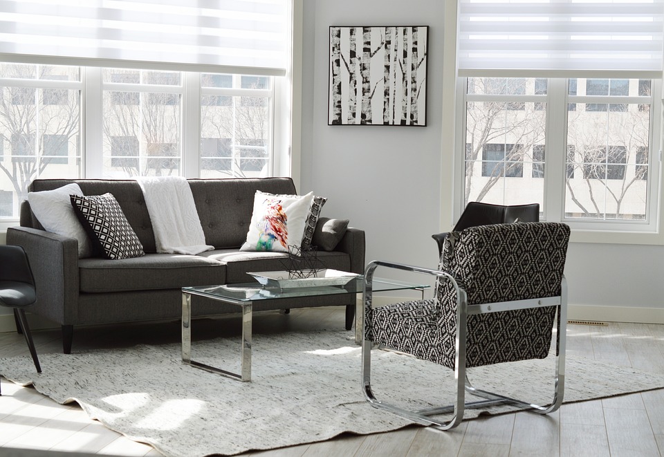
Great home stagers stay abreast of what’s trending in home design. They know exactly which trends can help your home sell faster (Outdoor living spaces! Stainless steel appliances! Fresh, airy bathrooms!) and which you should avoid at all costs.
Take it from us. When staging goes wrong, it can go really wrong and actually work against you as you try to sell your home.
Here are three home staging trends Creative Home Stagers wants you to run, not walk, away from.
- The Trap of “Overdesign”
Have you ever been in a model home in a new development that had accent wallpaper in every single room, huge chandeliers hanging from every ceiling, and oversized statement furniture that was hard to move around? That’s the very definition of “overdesign.”
Your house is the star, not the backup singer, which is why it’s important that the furniture and décor used to highlight it aren’t the first things buyers notice. Having a keen eye for colors is important, yes, but a home that’s on the market is no place to show off a stager’s penchant for out-there design. Staging should be neutral, it should be approachable, and it should appeal to as many buyers as possible.
- Crazy-Specific Room Uses
It’s one thing to stage a bonus room as a playroom or to outfit the finished basement with a moveable bar and a big-screen TV. It’s quite another to decorate a “man cave” wall-to-wall in Pittsburgh Steelers paraphernalia or to create a veritable “Shrine to Star Wars” in your son’s bedroom. Good staging is about restraint.
Yes, it’s important to define all the spaces in your home so buyers can see how they might use them but over-defining those spaces can be just as limiting. A good stager will suggest a few options for the spaces in your home that don’t have obvious uses, and none of them should include the words “Pilates studio.”
- All White in Every Room
Millennials, in particular, seem to gravitate to particularly minimalistic design. That’s great for stagers who’ve long preached the virtues of truly neutral rooms. What it doesn’t mean is that a home and its contents are most attractive when they’re an Ode to the Color White.
White (or Eggshell, or Ecru) is a great color for brightening up a space, but it’s an accent, not a theme. Without some color – even if it’s neutral colors like gray or brown – rooms tend to all blend together and buyers can easily lose their sense of space. If everything’s white, it’s hard to draw attention to the really positive attributes of your home.
Don’t let bad staging scare you off of the process. The experienced, accredited stagers at Creative Home Stagers have been helping Charlotte home sellers get top-dollar for their properties for years. We know what sells and what doesn’t.
Call us for a free consultation today.

